1. Planning for CD cover
We are going to produce a CD cover as an ancillary product as part of the project. The
genre techno pop has provided a large amount of options for our CD cover.
I plan on the cover being very simplistic yet very colourful and inventive. I have taken
this idea from many different techno pop CD covers such as Electric Café by
Kraftwerk. We will also use the idea of the design from this cover. This is because it
is relatively simple to do and will be able to professionally created using Adobe
Photoshop Elements. The few bright colours will join in with the generic conventions
of techno pop.
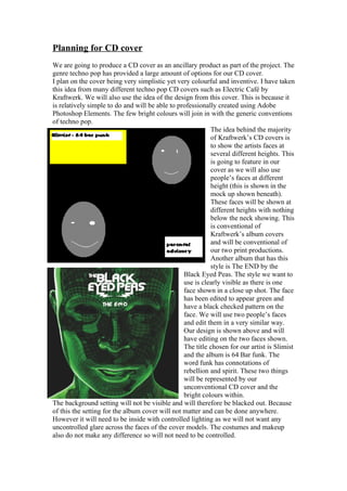
The idea behind the majority
of Kraftwerk’s CD covers is
to show the artists faces at
several different heights. This
is going to feature in our
cover as we will also use
people’s faces at different
height (this is shown in the
mock up shown beneath).
These faces will be shown at
different heights with nothing
below the neck showing. This
is conventional of
Kraftwerk’s album covers
and will be conventional of
our two print productions.
Another album that has this
style is The END by the
Black Eyed Peas. The style we want to
use is clearly visible as there is one
face shown in a close up shot. The face
has been edited to appear green and
have a black checked pattern on the
face. We will use two people’s faces
and edit them in a very similar way.
Our design is shown above and will
have editing on the two faces shown.
The title chosen for our artist is Slimist
and the album is 64 Bar funk. The
word funk has connotations of
rebellion and spirit. These two things
will be represented by our
unconventional CD cover and the
bright colours within.
The background setting will not be visible and will therefore be blacked out. Because
of this the setting for the album cover will not matter and can be done anywhere.
However it will need to be inside with controlled lighting as we will not want any
uncontrolled glare across the faces of the cover models. The costumes and makeup
also do not make any difference so will not need to be controlled.
2. We are going to place the album cover in the top left hand corner as this is a
conventional place to put it. This will help to emphasise the artist and album name
above the images and cause the audience to respect and admire the artist more.
The faces on the album cover will be shown looking towards each other but at
different heights. One of them, the solo artist, will be positioned higher and looking
down on the other face. This will highlight the importance of the artist over the other
random person.
We will take the photo using a digital camera and upload it onto the computer. We
will then edit it using Adobe Photoshop elements to help create the desired effect.
Font
-Fighting style
-Action of the time
- Pulse
-Cheatin
- Blox
Our title will be styled accordingly with the font pulse from www.dafont.com. This
font has jagged edges and will fit in well with the images causing a clash between the
smooth faces and the jagged font style. Also it appears to be very high tech and
futuristic which will appeal to the target audience of techno pop which is young adults
between 16 and 25.
Language
The language on the back of the CD will directly address the audience by using buzz
words that will incorporate the reader’s thoughts and tell them what they will find in
the album. They will be about 50 words on the back in large decorative font.
Outlining what will be found inside the CD sleeve.
3. Camera Work and Editing
The only camera work required for our CD covers will be the work on the front cover.
This will be of a male and a female at alternate heights looking towards each other.
The faces will be shown at with a close up shot. This is to emphasise the closeness the
audience will be feeling to the artist.
Using this approach will make sure that
the relationship between audience and
artist is the appropriate type. The camera
angle will be slightly below the peoples
faces in order to help impose the persons
face. This will make the artist appear
more important as the audience will
seem to be looking up at the artist,
imposing his authority.
The people’s faces will be edited. We
will do two different photo shoots; one
with masks on the man and woman and
one without. We will choose the best
piece of work and will use that as our
ancillary product. If they are wearing
masks we will edit it to make it appear in a similar way to the Black Eyed Peas THE
E.N.D album cover.
However if we use the ones with just the faces then we will edit it to make it look like
the colouring is done in different sections in a similar way to the Kraftwerk album
shown earlier.
Mock Up
This is the mock up album cover for the lay out our group decided on. Although I
believe that the layout is approximately correct there are many small changes that
could easily be made. The main problem I have with the cover is the background. The
colour clashes are way too over the top and would draw peoples eyes when on the
shop shelves but for the reason of being so garish. Also I have decided against the
idea of using masks instead of faces. This is because there is a large lack of emotion
on the mask face even when it has been edited to have appropriate colours as it has
here. Human faces will be able to be shown to be looking in specific directions (i.e. at
each other) as opposed to the masks which cannot be shown to be looking at objects
or other people. Also the masks took a long time to edit and that time would not be
available to us for the real product.
Another issue is the logos with the album and artist name. The font doesn’t fit in with
the rest of the cover. The font looks like it has been electrified and this creates
contrast, in the wrong way, with the images of the masks. This is because the
connotation of masks is drama and acting whereas the connotation of electricity is
power or new technology.
The culmination of this is that I will have to completely reconsider the colour and
images on the album cover. However I will keep the album cover layout roughly the
same.
4. Idea change
I am considering changing my style completely. This is because I want to create a
distinctive style that is synonymous with the style of the rest of my team. Also, after
comparing our work I have decided their style would suit the genres of techno pop
more.
We are going to do the idea in a cartoon style as this is easy to do effectively. Also
this is what would appeal to my target audience of young adults as it features an
alternative style that would be easily adaptable to other products such as a magazine
advertisement.
Font
The font I have chosen for my new design title is varsity. This is from
www.dafont.com and is in the old school section. I chose this because it can easily be
edited and filled in with my custom colours and shading styles. Also it is in the style
of an American university font. This would incorporate younger people into my target
audience. This would interest young people aged 18.-25 because that is the age people
go to university and they would recognise the font as being their font.
5. Layout
For this design I am going to use a large logo in the top left hand corner of the cover.
Then I am going to feature a secondary image mounted away from the title but
interacting with the title in some way. For example, in my preliminary design I
mounted the title on a baseball and had the secondary image as a batter hitting the ball
away. The reason I had the title in the top left corner is because that is where any
potential customer would look first. This is because this is how people read going
from left to right and top to bottom. Also, if it is set out on its own, like in the design,
it will draw the customer’s eye on the shelf.
For this design I put a preliminary design forwards of a man hitting a baseball with a
bat. In the finished product it would be a real baseball and batter. This would however
be edited to look quite cartoonish and this would help it appeal to teenagers more.
This is because it involves two things that typical teenagers enjoy; sports and music.
There are really only 6 colours that are being used white, green, red, black, grey and
brown. This simple design will appear attractive to teenagers as it is a reductionist
design. This will be
effective because all
the teenagers will take
in will be the sports
star and the 5 star
rating. This will just
provide them with two
positive images that
teenagers can
associate with and
aspire to be like.
Views on Design
I like the look of this
design, but I feel that
the title (located on
the ball) is not clear enough. I plan on solving this issue by lightening the colours on
the ball (the red and black stitching) and filling the background behind the ball in with
a sky blue colour. Also I will increase the size of the ball to make the title appear
more significant. Another change I will make is edit in text in the background in the
same style as the title. This is not designed
to be noticed and will be in white on a pale
sky blue background.
Final Views
I do believe that this design has improved
over time and will provide a good base for
my final design. The design of small
details will change but the layout will
remain unchanged.
6. Images of Similarly styled Products
My cover will be using some conventions from images like these. These are simple
images that can easily be changed and edited. To demonstrate the simplicity of
creating an image in the style of
a cartoon I have created a face in
the same style as the one in ‘In
My Mind’ by Pharrell. This has
been done very quickly and now
can easily be edited in order to fit
in with my album’s cover.
7. Planning for the back of CD sleeve
As well as the front cover for the CD we also have to create the back cover of the CD
case. This is going to be harder as I don’t have as much experience in creating the
back as I do creating the front. However I will examine real life CD backs and draw
inspiration for mine from them.
Because of there being a lack of CD back covers I will have to improvise and use
other styles of CD covers as inspiration
instead of techno pop.
This cover is a very conventional cover. The
title is located in the top part of the CD cover
and central. This helps show the importance of
the name of the album and helps to emphasise
the importance of the main title. Also the
names of the songs are neatly lined up. I will
not have to decide where to put my songs as I
am doing an individual song cover and not an
album cover. In place of the song names I am
going to have writing (similar to a blurb on a
book). This is going to describe the music in
the song. Also I will provide details about the video in the blurb. These will include
details of how it is made and what the video contains. Also the artist’s signature will
be featured on the back cover to guarantee the albums authenticity. The signature will
be created by one of us and will be the artist’s real name (which will be decided on).
Potential Artist Names
Carl Brett
Jeff Crash
Phil Hobbs
Vinny Sheldon
Evan Bass
Jackie Goblet
Chris Leech
Mike Crew
Frankie Allan
Matt Edwards
Dan Blackstock
Adam Crandall
Steve Hughes
Doug Hayes
Stevie Bowie
8. Name Choice
We produced a list of names from a random name generator on the internet. We
wanted a name that was very common so we carefully selected common names from a
list. The names we ended up with were Mike Crew and Chris Leech. These signatures
will be easy to create and will not take long to create signatures for.
Layout
The layout for the back of the CD cover will feature a large image featuring the artist
and a small amount of decorative texts showing the artists thoughts behind the album
I have designed a very basic CD cover of what I would expect that my CD back
cover. I have designed this in Adobe Photoshop Pro.
I am not accepting this design for several reasons. The main problem with it is that the
design is not concordant with my front cover design. This will make it look extremely
strange and doesn’t fit in with the cartoonish styling of the first front cover practice.
This is very important and if it doesn’t fit the front cover it will not be aesthetically
pleasing.
New Layout
For my new layout I will not include a title. This is because this is the back cover and
the main title is featured on the front cover of the album/CD. Also the song names
will be featured on the back cover down one side. This enables me to have a large
image on one side. I will stick with the idea of having the artist’s signature on the
back cover but it will be smaller and in the bottom right hand corner.
The image will be of the artist’s face in a cartoony style. This is so that it is co-
ordinated with the front cover as well. This solves the previous problem that we had
of the styling not matching up.